The Zone System is a technique that was formulated by Ansel Adams and Fred Archer back in the 1930's. It is an approach to a standardized way of working that guarantees a correct exposure in every situation, even in the trickiest lighting conditions such as back-lighting, extreme difference between light and shadow areas of a scene, and many similar conditions that are most likely going to throw off your camera's metering giving you a completely incorrect exposure.
Your camera's metering modes are built to give you a correct reading under most average situations. But when you're faced with an exceptional situation, your camera's metering can easily be fooled, thinking a scene is brighter or darker than it actually is. This is where knowledge of the zone system can save you a lot of trouble, and help you capture not only correct but also intriguing exposures every time.
Although calculations for the zone system were originally based on black and white sheet film, the Zone System is also applicable to roll film, both black and white and colour, negative and reversal, and even to digital photography.
Benefits of Utilizing the Zone System
Capturing a correct exposure every time, even in the trickiest light or scene situations.
Having a precise evaluation of your scene's tones and dynamic range prior to even making a shot.
Knowing when you need to use graduated neutral density filters.
Knowing exactly how far apart to take exposure bracketed shots for later blending.
Determining the situations where you need to use a fill flash to get a correct exposure.
Middle Grey
The camera metering is designed to give correct readings under average circumstances. This means that the camera would look at a scene and try to render it as average reflectance (18% reflectance), which is middle grey (a value right in the middle between pure black and pure white). When a scene contains too much bright, however, the camera tries to render it as average so it darkens it causing under-exposure. On the other hand, when a scene contains too much dark, the camera tries to render it as average so it lightens it causing over-exposure.
We as human beings see in colour rather than black and white, and there are colours that are considered average. Meaning, they reflect an average amount of light, which is around the same amount that middle grey reflects. Learning the average tones is fundamental for deploying the Zone System.
The Zone System's Key Concepts
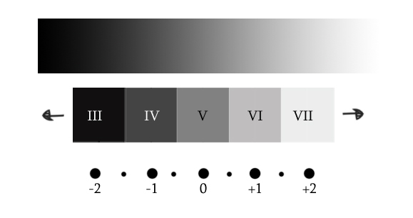
The zone system divides a scene into 10 zones on the tonal scale (though there are variations of 9 and 11 zones). Every tonal range is assigned a zone. Every zone differs from the one before it by 1 stop, and from the one following it by 1 stop. So every zone change equals 1 stop difference. Zones are identified by Roman numerals, with the middle tone (with 18% reflectance) being a zone V which is zone 5.
For us digital photographers, we are only concerned with zones III through VII (zones 3 through 7). The darkest part of a scene would fall into zone III, while the brightest part of a scene would fall into zone VII. Anything darker than zone III would render as pure black with no detail (under-exposed), while anything brighter than zone VII would render as pure white with no detail (over-exposed).
If you point your camera at an area with average reflectance and obtain the correct meter readings (a zero on the light meter), that area would be rendered as average. If you open up your lens or slow down your shutter speed by one stop, that area will become over-exposed by one stop. If you close down your lens or increase your shutter speed by one stop, that area will become under-exposed by one stop.
Now, we've agreed that an average tone is naturally placed into zone V. If you over-expose it by one stop, you'll be placing it in zone VI (zone 6), causing it to render brighter than it actually is. If you under-expose it by one stop, you'll be placing it in zone IV (zone 4) causing it to render darker than it actually is.
Placing Different Colour Tones in Different Zones
As can be seen by the above image, average colours would render correctly when put in an average zone which is zone V. By render correctly I mean, they will appear on the final photo the same way they look in reality with no over or under-exposure. Those tones include green grass or tree leaves, red flowers, clear blue skies, 18% grey card and the like...
Colour tones that are a bit brighter than the average, should be placed into zone VI. Those colours are more like pastels, or faded average colours. Those tones include pure yellow, bright-pinkish red, baby blue, baby pink and the like...
Colour tones that are brighter than that should be placed into zone VII. These include white snow, white clouds, fog, smoke, mist, bright sand...
Colour tones slightly darker than average should be placed into zone IV. Those include tree trunks, dark blue skies, and so on...
Colour tones that are darker than that should generally be placed into zone III. Those tones include black puppies, black shoes, extreme shadows, coal, and the like...
In digital photography, a generally correct exposure (technically speaking) of an average scene is one that is exposed for the mid-tones, with no blown out highlights. I emphasize on blown out highlights because highlight clipped photo details are more troublesome than shadow clipped photo details.
So if the dynamic range of a scene is greater than one to be captured with only one shot, you have the choice to sacrifice either the highlights or the shadows of a photograph. And unless the jeopardized highlight area is really too small to have any significance, you should always protect the highlights. Blown-out highlights yield a feeling of something missing in the photo, while blown-out shadow detail is more acceptable and sometimes even intentional for specific effects.
So to correctly expose an average scene, spot an average colour or tone. Adjust your camera settings till you get the light meter's hash mark on zero for that colour, make sure you're not overexposing your highlights and take the shot.
Below are a few photos, each with the colour tone interpretation right below it. This is to give you an idea on how to evaluate different colours, break down your scene, and place each tone in its corresponding zone.
Photo by Samy Lamouti dzpixel
In the above image, the yellow is a zone VI. Yellow is generally always placed in zone VI because it has +1 stop more reflectance than average colours. The slightly bright orange can also be considered a +1 here, maybe even a +1/2.
The saturated orange is average colour so it's placed in zone V. Red is usually always considered an average colour unless it's too dark or too bright. Here it's placed in zone IV for being darker than average. The floor is really bright, so it is placed in zone VII.
Photo by Claudio Alejandro Mufarrege
In this photo half way through the sky, the blue is average so it's placed in zone V. Towards the bottom, it gets brighter, right around zone VI. At the very top, it is around a -1 stop darker than average, so it is placed in zone IV. Regarding the trees and the grass, foliage usually always has an average colour unless it's very dark or very bright.
In this photo, the grass is around average so it is placed in zone V. The trees in the back to the right are approximately a -1 stop darker than average, so they're being placed in zone IV. The clouds are white but still retaining detail, so they're a zone VII. As for the road, its around -1 stop darker than average (maybe even a -1 1/2 stop darker) so it's being placed in zone IV (or in the middle between zone IV and Zone III).
Photo by s k o o v
In the photo of the lighthouse above, the sea towards the bottom is around average so it is placed in zone V. Going higher though, it starts getting darker till it gets around a -1 stop at the very top so that area could be considered a zone IV.
As for the sky, it's around average colour at the top and to the right, so that area is considered a zone V. Going down and to the left it gets a -1 stop darker than average, so that area would be a zone IV (maybe slightly brighter than a zone IV, so you could consider it a -1/2 or -2/3).
A little further down it starts to brighten up moving into a good zone VI and eventually a zone VII at the very end to the right. As for the dock, the colour is very dark with detail, so it is considered a zone III.
Photo by Ben Fredericson
I've chosen this photo to show you the varying tones foliage can take and how you would go about placing the different tones of green into different zones. To begin, the grass to the left of the frame is average reflectance, so it is placed in zone V.
Around the edges of the road going back to the left and to the right, it gets brighter somewhere around a +1 stop so it is considered a zone VI. The trees on either side of the road are around a -1 stop darker than average, so they are considered a zone IV. The bushes at the back are around +2 stops darker than average, so they are considered a zone III.
Photo by Jon Hurd
Here the sand is very bright while still retaining texture and detail, with +2 stops brighter than average, so that's a good zone VII. The dog in the white areas is also a zone VII, and in the dark area is around -2 stops darker than an average colour making a good zone III.
Notice that the dog's left eye is becoming just a tiny bit under-exposed which is OK, since taking the exposure down to retain the detail in such a small area of the entire frame would blow out all the whites. The very bright and very dark parts of such a scene take the dynamic range higher than a digital camera's dynamic range, so you cannot retain all shadow and highlight details with only one exposure. Plus, as we've said earlier shadow clipping is more tolerated than highlight clipping.
The clouds are bright with detail so they're normally a zone VII. The sky in this shot is brighter than average, making a +1 stop towards the top left of the frame so that's a zone VI.
Portrait Photography and the Zone System
While landscape photographers would be more familiar with placing nature's colour tones like the colour of mountains, trees, skies, seas and so on on the zone system, portrait photographers would be more familiar and more focused on skin tones and hair colour.
Most people generally fall between zone IV and zone VI, except for some exceptions like really bright or dark skin tones. When you're shooting people and portraits, you're most concerned about skin tones. Their clothes would have importance as well, but not as much as the person's skin tone, especially if only a small portion of their clothes appear in the photo.
Let's talk a look at how we go about placing different skin tones in different zones.
Photo by creativesam
This little guy above has a bright skin tone, somewhere around +1 1/2 stops brighter than average. So it falls between zone VI and zone VII. His bright clothes also still retain detail, so there's nothing blowing out there.
Maybe inside his mouth, shadow detail is clipped but that's OK. First, because we don't want to lose our highlight details by over-exposing to register that tiny shadow area. And second, as I've said earlier when a dynamic range of a scene is higher than one to be captured with just one shot, shadow clipping is more tolerated than highlight clipping.
Photo by Mr. Theklan
In this photo, the girl has a darker skin than the above little guy, just not as dark as an average colour. She's mostly around a +1/2 stop brighter than average. The highlights in her eyes and teeth are safe as well. There's not even any clipping happening in the dark areas such as her hair, clothes and accessories which is great.
Photo by Fabio Gismondi
This guy above has around average skin tone, so he would go into zone V. There's some clipping happening in the darker areas of his hair and the black fur, but as long as highlight detail is all there, that's OK.
Photo by Rajiv Ashrafi
This poor old lady is around -1 1/2 stops darker than average, so she's between zone IV and zone III. You would know she's not exactly a zone III by comparing the colour of her skin with the pure black of her hair. You would clearly see that her skin is brighter than that.
There is just a really tiny bit of highlight clipping on her left shoulder, but that's alright. If the area was larger than that, the shot might have needed to be re-assessed or recomposed to preserve all image details.
Evaluating High Dynamic Range Scenes
When a scene has a huge difference between it's darkest and brightest tones, that would mean it has a high dynamic range which makes it impossible to retain all those contrasting image details with one shot. So unless you're planning on taking multiple different shots for later blending back in post-processing, or using a graduated neutral density filter (which might not even be of help in all situations), you'll definitely have to make a choice. Are you rather off with clipped shadows or blown out highlights?
The vast majority of the time, the answer would be protect the highlights and let everything else fall where it may. Unless, the highlight area is actually too small to ruin the shot, is not of much significance to the shot, or trying to keep it on the account of losing the shadows would ruin the whole idea behind the photo, you should always protect your highlights.
Photo by Evan Leeson
Looking at the shot above, you'd be able to tell that either one of the highlights or the shadows are going to need to be sacrificed. Since you cannot go without that bright white fog covering the upper half of the frame and losing the whole mood of the shot, metering for the scene is quite simple. Take your reading off the bright fog, place it into zone VII, recompose and take the shot. Everything else would fall into place. Having clipped shadows won't be a problem, since that misty fog, the silky waters and the floating boat are what's adding so much value and drama to the photo.
Photo by Gwenael Piaser
In this example we know that the light coming through the window is way too empowering to make it possible to capture the outside and the inside with no detail loss with only one shot. The photographer has chosen to instead, make creative use of such a situation and render the people wandering about as stark silhouettes while still maintaining all that beautiful outside mood of the city which actually made the shot way more intriguing to the viewer.
Metering for this shot, you would just point your camera at that brightest area of the sky at the very top, place that in zone VII and let everything else fall where it may.
Photo by Jamie Hladky
In this photo having the sun within the frame, there is no way you can preserve all those extremely bright highlights no matter how fast you ride up your shutter speed. You will only be left with a huge dark area and a tiny bright dot and nothing else. For this reason, letting the centre of the sun blow out while retaining all other image details with the blue of the sky, the red of the poppies, and the green of the grass is so worth it.
An alternative in this case would be to change your perspective and recompose your frame in a way that doesn't include the sun within the shot, but I think for this particular one you'd just be killing everything that made it so special. Don't worry about the clipped highlights this time.